The 5 Proportion Mistakes Making Your Home Look Unfinished
5/17/20268 min read
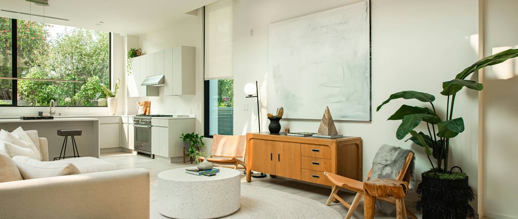
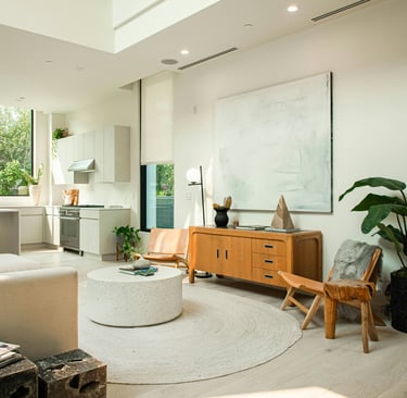
There is a specific kind of disappointment that comes from a room that looks right in photographs and wrong in person.
You have seen it from the doorway and thought it was almost there. You have taken pictures and been satisfied. But when you actually sit in it, when guests come over and stand in it, when you live in it day after day, something feels off in a way you cannot quite name. The room looks fine. It does not feel expensive. It does not feel finished. It does not feel like the rooms you admire.
The gap between a room that looks expensive and one that merely looks adequate is almost never about cost. It is about proportion. The same furniture, the same palette, the same objects on the same shelves, arranged with and without an understanding of scale, produce completely different results. One reads as considered. The other reads as assembled.
The rules of proportion are not complicated. They are just rarely taught. And once you know them, you will see every room differently.
What Proportion Actually Does in a Room
Proportion is the relationship between the sizes of things. Between the rug and the furniture sitting on it. Between the art and the wall it hangs on. Between the curtain and the window and the ceiling above it. Between the height at which things are hung and the height at which a human eye naturally travels.
When these relationships are right, the room feels settled. Nothing asks for attention because nothing is out of place. When they are wrong, the room feels subtly agitated, as though something has been forgotten or something is just slightly too large or too small without it being immediately obvious what.
The mismatch rarely announces itself. It just creates a background feeling that something is not quite right, which is why most people try to fix it by adding things rather than adjusting what is already there.
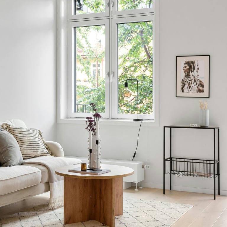
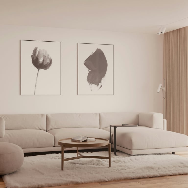
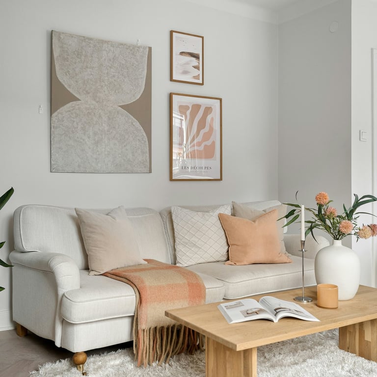
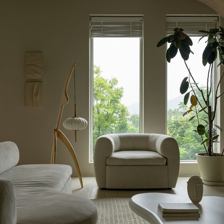
Five Proportion Mistakes That Make a Room Look off
1. The rug is too small
A rug that is too small for a room is one of the most common and most visible proportion mistakes in home decorating. It reads as an afterthought. A small rug placed in front of a sofa, with the furniture floating around it rather than anchored to it, makes the seating arrangement look temporary and the room look unconsidered.
The rule is straightforward. In a living room, all four legs of the main seating should sit on the rug, or at minimum the front two legs of every piece. The rug should define the seating area as a zone rather than sitting within it like an accent. A rug that is too small creates visual tension between the furniture and the floor. A rug that is the right size resolves that tension instantly.
Most people who have a rug that is too small bought the size they thought was correct, or the size that was most affordable, without measuring first. The right size for a living room is almost always larger than instinct suggests. In most rooms, that means an 8x10 at minimum. In larger rooms, a 9x12.
SAFAVIEH - Reflection Collection Beige Cream Area Rug
Machine-woven, low pile, non-shedding. Warm neutral tones that anchor a seating area without competing.GarveeHome - Neutral Beige Boho Vintage Washable Rug
Distressed vintage pattern in warm beige. Non-slip, stain-resistant, machine washable.WondRg - Beige Cream Washable Area Rug
Soft low pile with a warm neutral floral. Lightweight and easy to reposition while testing placement.
2. The art is hung too high
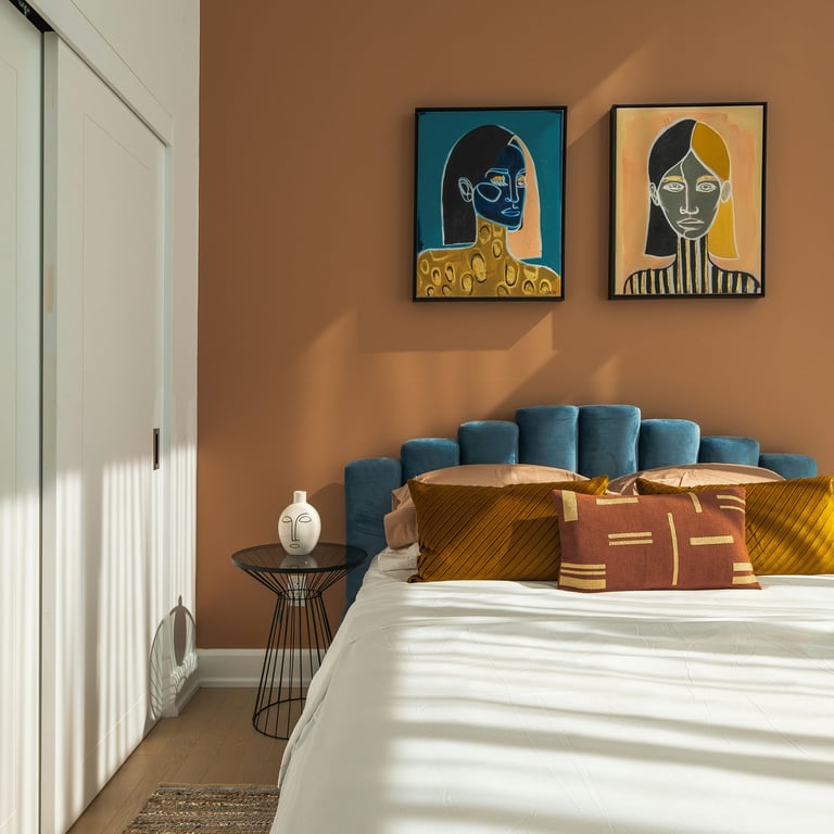
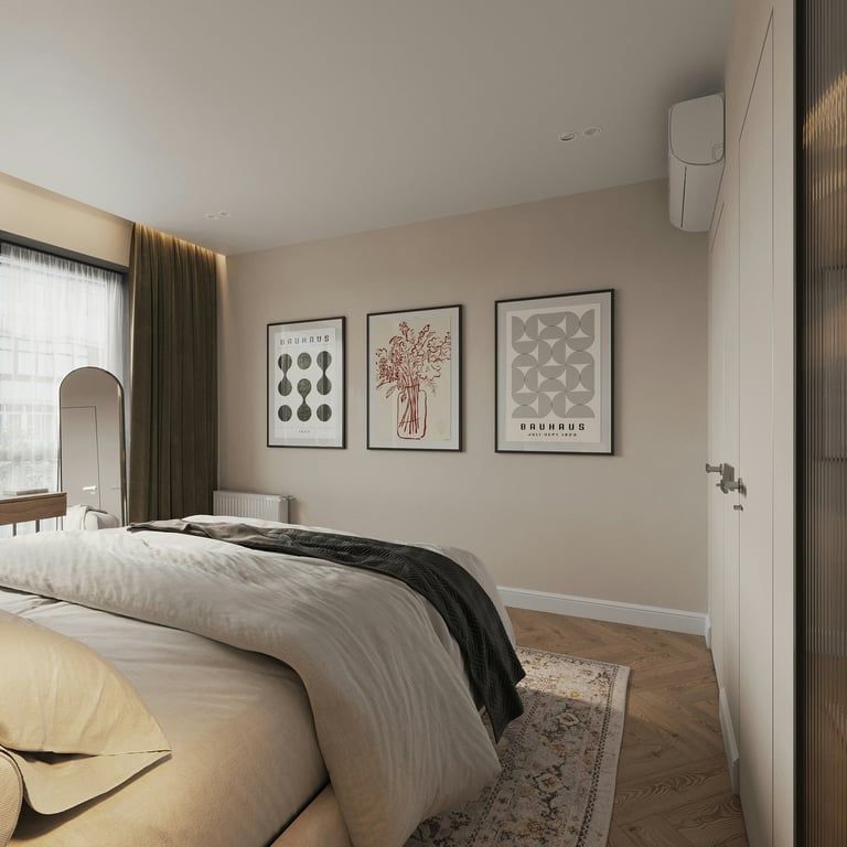
Art hung too high is the single most common hanging mistake and one of the easiest to fix. When art is too high, it appears to be floating above the furniture rather than in conversation with it. The room looks unfinished from the eye level at which people actually occupy it, even if it looks fine when you first walk in and glance around.
The standard that galleries and designers use is to hang art so that its centre sits at approximately 57 inches from the floor, which is roughly average human eye level when standing. When hanging above furniture, the bottom edge of the artwork should be six to eight inches above the top of the piece. Close enough to read as related. Not so close as to feel crowded.
In a room where art has been hung too high, lowering it is one of the fastest and least expensive transformations available. It requires a screwdriver and an afternoon, and the difference is immediate.
OurWarm - Large Framed Abstract Canvas, Set of 3
Soft neutral textured tones. Three-panel set that gives a wall presence without a single large piece.Large Framed Neutral Abstract - Set of 2
Brown, beige and grey tones, framed. Works above a sofa or console at the correct hanging height.
Minimalist Botanical Canvas Print, Framed
Warm neutral palette, beige vase, botanical subject. Calm and understated for any room.
3. The curtains don't reach the floor
Curtains that stop short of the floor are one of the most reliable ways to make a room look cheap. They signal an afterthought, a panel bought in a standard size without measuring the drop, or a decision made for practical reasons that created a visual one. The gap between the curtain hem and the floor, however small, draws the eye downward and breaks the vertical line that curtains are meant to create.
Curtains should either skim the floor within half an inch, pool slightly at the floor for a softer effect, or hang from as close to the ceiling as possible to maximise the sense of height. What they should not do is stop at the window frame, the windowsill, or anywhere in the space between the windowsill and the floor.
The same logic applies to where the rod is mounted. A rod mounted directly above the window frame makes the window look smaller and the ceiling lower. A rod mounted several inches above the frame, or as close to the ceiling as is practical, draws the eye upward and makes the room feel taller. The curtain fabric costs the same either way. The effect is completely different.
Guken - Natural Linen Curtains 96", 2-Panel Set
Rod pocket, semi-sheer, cream ivory. Floor-to-ceiling length that works from ceiling-mounted rod.
LAMIT - Linen Semi Sheer Curtains 96", 2-Panel Set
Back tab and rod pocket, cream ivory, light filtering. Clean hanging line from ceiling to floor.
Wolistsa - Brushed Warm Gold Curtain Rod, Adjustable 34-92"
Heavy duty carbon steel, warm brass finish. Mount close to the ceiling for maximum height effect.
4. The metals don't agree
A room with mismatched metals is not a room with character. It is a room where the decisions were made separately without reference to each other. The chrome tap, the brass light fitting, the nickel cabinet handle, the black curtain rod. Each one was chosen in isolation, at different times, in response to different problems. Together, they create a visual noise that is difficult to identify but impossible to ignore.
Mixed metals can work, but only when the mixing is deliberate. One dominant metal, appearing in the largest or most visible fixtures, and one secondary metal used sparingly as an accent. The rule is intention. What looks chaotic is not mixed metals but unintentional mixed metals, the kind that accumulated over time without anyone deciding.
The easiest fix is not to replace everything at once but to identify the dominant metal in the room and make all new purchases match it. Over time, as pieces are replaced or updated, move toward that single metal. Brass is warm and works with most neutral palettes. Matte black is graphic but clean. Brushed nickel is cooler and more minimal. Choose one and commit.
5. The furniture is the wrong scale for the room
A large sofa in a small room makes the room look cluttered and the sofa look cheap. A small sofa in a large room makes both look wrong. Scale is the relationship between the size of the furniture and the size of the space it occupies, and when it is off, no amount of styling will fix it.
The most common mistake is buying furniture that is too large, usually a sofa, because it feels generous and comfortable in the showroom and overwhelming in the room. The second most common is buying accent furniture that is too small to have presence. A side table that is dwarfed by the sofa next to it. A lamp that disappears beside the chair it is meant to light.
Before buying any significant piece of furniture, measure the room and tape out the footprint of the piece on the floor. Walk around it. Sit in the space. Imagine the room with the piece in it. This takes ten minutes and prevents a decision that will take years and significant money to undo.
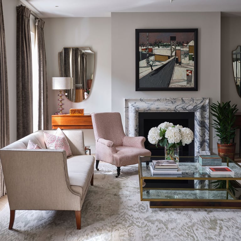
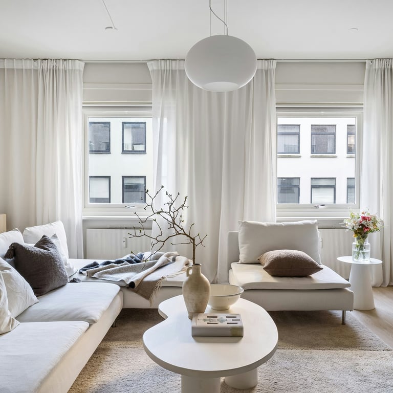
How to Fix the Proportion in Your Home
Size up the rug
Before buying a new rug, measure the seating area and confirm the size you need. In most living rooms, that is an 8x10 or larger. Tape out the dimensions on the floor before ordering to confirm. The rug should sit under the front legs of all the main seating, at minimum. Once in place, it will make the furniture look intentional and the room look complete in a way that a smaller rug never can.
Lower the art to eye level
Find the centre point of each piece of art and mark where 57 inches sits on the wall. Rehang every piece so its centre is at that height, or six to eight inches above the furniture it sits above. Do this in one afternoon. The room will look noticeably different without a single new purchase.
Take curtains to the ceiling and the floor
Move curtain rods to the highest point practical, as close to the ceiling as possible. Order curtains in a length that reaches the floor, 96 inches in most rooms with standard ceiling heights, or measure the exact drop from the rod to the floor and add one inch. A rod close to the ceiling and a curtain that skims the floor draws the eye upward and makes the room feel taller, more expensive, and more finished.
Choose one metal and let it lead
Walk through the room and note every metal finish. Identify which appears most often or in the most prominent position. That is your lead metal. From this point, make all new hardware, lighting, and fixture purchases in that finish. Do not replace everything at once. Just stop adding to the confusion and begin slowly resolving it.
Measure before you buy
For any piece of furniture, tape out its footprint on the floor before purchasing. For any rug, do the same. For any art, cut paper templates and hold them on the wall at the correct hanging height. These small pre-purchase steps cost nothing and prevent the most common and most expensive proportion mistakes.
Save This: Five Proportion Rules for Every Room
Rug size: front legs of all main seating on the rug, minimum 8x10 in most living rooms.
Art height: centre of the piece at 57 inches from the floor, or 6-8 inches above furniture.
Curtain drop: rod as high as practical, hem skimming the floor or just touching it.
Metals: one dominant finish throughout, any second metal used sparingly and intentionally.
Furniture scale: tape the footprint on the floor before buying any significant piece.
Apply these rules before adding anything new. Most proportion problems are solved by adjusting what is already there, not by buying something else.
Final Thought
A room that looks expensive is not a room that cost more. It is a room where the proportions were considered.
The rug the right size. The art at the right height. The curtains reaching the floor from a rod close to the ceiling. The metals agreeing with each other. The furniture scaled to the space rather than chosen for the showroom. None of these decisions require a larger budget. They require the knowledge that these things matter and the decision to act on that knowledge.
Proportion is the difference between a room that looks almost right and one that looks finished. And almost every room is one or two adjustments away from the latter.
Next week we look at the living room problem: why the room that is supposed to bring everyone together is the one that works for no one.
Stay Elevated
The Adair Lane.